Showing posts with label painting. Show all posts

Saturday, 29 May 2010

Technology worship rituals: Katie Paterson and Adam Dix at Haunch of Venison, London review


Detail of painting by Adam Dix, photograph copyright Margaret Sharrow 2010


If you are visiting the Royal Academy, perhaps to see the Glasgow Boys, Treasures of Budapest, or to pop into No New Thing Under the Sun (the latter being a very interesting mixed exhibition in a room, free until 9 January 2011), take yourself out the front exit, turn right, right again, and come to the classically columned front directly behind the Royal Academy. This is Haunch of Venison, part of a series of high-end private galleries (there are also Haunches in Berlin, Zurich and New York), that sometimes acts as an overflow exhibition space for the RA (as with the excellent Earth exhibition in 2009. The quality of work in Haunch of Venison is always extremely high, and frequently much more cutting-edge than the work at the other galleries strung along Cork Street, which is what you face when you leave the gallery. The work never feels crowded in the generously sized rooms, yet it is not the ultramassive space that one finds in the Saatchi Gallery, or the Baltic in Newcastle.


Recently, there's been work by, among others, the pop artist Tom Wesselmann. But for me the real standout was an extensive series of paintings by Adam Dix and conceptual works by Katie Paterson, part of the Transmission exhibition that ran from 7 October - 6 November 2010. Perhaps they are people who, like me, was captivated by the PBS television series Cosmos hosted by Carl Sagan, with his stories of humanity's relationship with the wider universe. In effect this is Adam Dix's theme: the paintings depict humans engaged in ritual, borrowed from a range of iconographies: medieval, processional, photographs of gymnastic exercise, weddings and early television watching. But in each case the ritual is juxtaposed with an anachronistic item of technology. The bards at a Welsh eisteddfod are grouped around a microwave transmission tower. Traditionally costumed festival goers of indeterminate European origin bear satellite dishes at the end of poles instead of flowers or candles. An idealised 1950s family watch television, their ears plugged into iPod earphones, with curious white discs, or nimbuses, hovering over their heads. It is at once dislocating, slightly uncomfortable, and yet it makes sense. Are the people ritualising the technology, worshipping it as people did other things in the past, really us? Are we just as superstitious now, in a way that we imagine to be perfectly rational?


Paterson's work takes us further and further from earth. E.M.E. stands for 'Earth-Moon-Earth', an installation comprising a baby grand piano that plays itself, according to a score that can be followed from a nearby book. The music is Beethoven's Moonlight Sonata, which was translated into Morse code (which das and dits you can hear through headphones), distorted by bouncing off the surface of the moon, and beamed back, minus a large number of randomly spaced notes. This is the version that the automatic player-piano-with-electronics-not-paper-scrolls presses out, mechanically, endlessly, with odd lacunae, pauses and hesitations, and short intervals of silence just before the final cadence. Translation, mistranslation, mechanical misunderstanding. Beethoven sang an ode to the moon, and at last the moon sings it back to us. The moon appears again in a different installation, in which a single bulb hangs in an otherwise dark room, emitting light balanced not to mimic daylight, but moonlight. Nearby is a box with a lifetime's supply of such bulbs. Moonlight for life.


In a different room, a box full of slides of a potentially infinite series of photographs of space. No stars are visible (though many are pinpointed on a nearby work): a series of sample prints are all uniformly blank. They are stamped by Paterson with their edition numbers: an infinitely tiny number in a set comprising infinity. Photographing every sector of space is a project that will never finish. The physical expression of these works, i.e. what is in front of you on the wall, is less compelling than the other pieces. But the impact of the idea, which sets you free in Sagan's 'spaceship of the imagination', is far more powerful.


more images from the exhibition


Katie Paterson at Haunch of Venison website


Katie Paterson's website


Adam Dix's website


Katie Paterson at Haunch of Venison: more images


All photographs are installation views and many are details.
Copyright of the images remains with the artist Katie Paterson.
Photographs by Margaret Sharrow, 2010


Review: Dexter Dalwood's Turner Prize talk (thoughts on 'the Darth Vader of painting' and visual sampling)


Image: Dexter Dalwood, 'Sharon Tate's House', 1998


setting: a room, but with people


Grateful to have a place in the fully booked venue, I settled into my seat to await the start of the second of Tate Britain's series of talks by each of the artists on the Turner Prize shortlist. Having missed the Otolith Group talk on 22 October, I was able to attend the talk by Dexter Dalwood, which took place on 5 November 2010 in the Tate Britain auditorium (accessed through the Clore Gallery entrance).


The talk format was a structured but fairly informal conversation between Dalwood and Michael Bracewell, writer and critic. The latter part of the talk was accompanied by a slide projection, mainly of examples of Dalwood's work. What follows is a filling out of the more coherent parts of my notes from the talk. Direct quotations are, therefore, approximate... and sections have been rearranged, and dropped out, like the Morse code Katie Paterson sent to the moon and bounced back, minus random bits of information.


advice to students


Dalwood spoke of the need for 'an odd passion for looking at stuff to get you involved in making ... Once the light goes on there's no reverse gear from the nerdy aspect.'


Advice to students included the idea that ideally, if yourself as you were on the first day at art school was to time travel and walk into your degree show, the earlier self would be 'totally shocked and surprised'.


He spoke of having to map out a course for yourself: in his case, he went through a series of narrative paintings with figures during his BA at St Martins; a time of 'bad semi abstracts' at the RCA; and then a time when he was 'lost' and unable to paint.


He recalled advice he had from Paula Rego in a tutorial at St Martins:


'"Always be as cruel as you can." It's a good thing to think about - not blood and guts but in making, risk, push it out. For you it might be a huge revolution, for viewer they might say, "oh, it's such and such". Always be pushing up the ante. Deliberately make it hard in a way, but not to numb it. That's the only advice I remember from college.'


contexts for Dalwood's practice


Dalwood said he came to art through music, not the other way round as is perhaps more typical. Growing up he had an awakening with the advent of the Velvet Underground, a glamourous fantasy come to life. 'I was excited about the idea of the Velvet Underground. The space in New York to do with Warhol was light years from the grim Bristol existence in the 70s.'


Dalwood spoke of the A New Spirit in Painting show at the Royal Academy in 1981 where figurative painting was allowed in after being sidelined in the 1970s, of a peculiar subjective expression allowed back. Philip Guston was very important after the shift, as were Julian Schnabel and David Salle. In the mid 80s, he contended, there was a backlash against market control of success, when 'painting appeared to behave badly'. Photography, he said, then became the main postmodern form, while painting had to recarve out territory. Gerhard Richter was the main exponent - 'he became the sort of Darth Vader of painting'. In the wake of Richter everyone thought that if they were serious they would have to think conceptually, a phenomenon that was more endemic in the UK than Germany. Blurring the photo became the look, with few doing something different, though examples of divergence included Peter Doig's romantic dreamscapes, which Dalwood perceived as fresh. Generally there didn't seem to be a territory one could occupy in painting, when there seemed few acceptable avenues to pursue.


Things have changed a great deal, Dalwood said, since the time when a great cultural weight was given to abstraction, which 'feels like a hundred years ago'. He cited the example of the 'incredible hubris' of Clyfford Still, who famously remarked that when his paintings landed in France you could feel tremours all the way to the Kremlin. So when Dalwood decided to use one of Still's paintings as an element in his painting to represent the peeling wall of a swimming pool ('Brian Jones' Swimming Pool', 2000), he felt it would evoke pathos.


Image: Dexter Dalwood, 'Brian Jones' Swimming Pool', 2000


on the art historical references in the paintings


When asked how important it was to him that the viewer knows the references, especially the younger viewer, or one from a different culture, Dalwood emphasised that the paintings are not a checklist. The Tate St Ives show for which he was nominated for the Turner Prize was the first show with titles of the paintings on the wall. In Dalwood's commercial shows the viewer sees the painting first, then the title on the printed list supplied by the gallery. It is an important point: Dalwood has chosen not to provide the viewer with signage, because he wants the viewer first to see the work as paintings, as images, and second to read the title, and thirdly to make further meanings. He sees the paintings as being like 'pebbles that make ripples that keep going' or as 'an irritant to the viewer' because they might have their own image of what a particular famous room might look like, and discover that Dalwood's painting is 'nothing like my version, like the novel compared to its adaptation into film'.


on Dalwood's working methods


Dalwood starts work on a painting with sketchy pencil drawings which may have a bit of a collage element added, then moves on to make a collage, quite a small one (smaller than A4 or 8" x 11"). The transition from collage to painting is 'where it all happens'. He is not interested in translating the collage in a photographic way into a painting, but in how the collage acts as a springboard that lets him invent. The excitement for him is 'how I do the lamp for an 8x6 foot canvas, not replicating the photo'.


He has become interested in how to use flat colour, how colour in itself is a powerful element in painting. Dalwood had a one year scholarship to India during which he studied miniature paintings, which fascinated him as examples of how to set up a theme or mood with one colour, a technique he has adopted into his own work (look at the expanses of colour, for example the carpet, brick wall and massive ceiling light in 'Sharon Tate's House', 1998).


on sampling


Dalwood says he is at ease with the concept of sampling in painting, a visual equivalent of music sampling. David Salle chopped up elements in his paintings with no hierarchy, but we are well past that now, Dalwood contends. 'It's how we construct our lives. It's easy for me to use quotes from different things as a language with some energy if the things are more than the sum of its parts. If I'm editing I ask, why would that work? Is it too corny, too obvious? Painting will have an odd quietness where you find a moment when it settles and functions as a painting.'


He began to think about collage elements on the surface of the painting. 'Robert Rauschenberg's Bed was the most alarming painting I could imagine making and putting in a gallery.' Made in 1955, this 'bed with paint' made Dalwood see him as 'a giant... a leading postmodernist exponent, along with de Kooning'. He struggled with how to include collage without it being arbitrary but part of the fabric of the painting.


'If you were in a prison cell and given two magazines a week you could construct a whole other world from just that plus what you think of.'


'We sample stuff in our heads - books, films we haven't seen - yet I could tell you about them. I feel totally easy about it; it's a valid thing to do. But it took a long time to get to that point. You have to do what's right for you. At art school I was asked "Why do you put things together so awkwardly?" Perhaps awkwardly is the point of the work. What you do naturally odd - there may be a reason for it.'


Notice of the talk on Tate Britain website


Documentary of Dalwood shown at 2010 Turner Prize exhibition


TateShots 'Meet the Artist: Dexter Dalwood' documentary about the Tate St Ives exhibition 23 January - 3 May 2010


Turner Prize 2010 review: Tate Britain's apples & oranges annual


Installation view of Otolith Group at the Turner Prize exhibition, 2010. Image copyright Margaret Sharrow, 2010

As always, the Turner Prize seems to offer comparisons between apples and oranges - a difficult task to compare diverse work in different media. This year the visitor sees, starting at the exhibition entrance and walking straight through, paintings by Dexter Dalwood, film and video installations by the Otolith Group, sculptural paintings and sculpture by Angela de la Cruz, and sound art by Susan Philipsz.

It helps to know that what is actually being compared is not the work on show, but the exhibitions (elsewhere) for which the artists were nominated. As I've only seen Dexter Dalwood's show at Tate St Ives, I can't offer any perspective on whose exhibition most brings out the qualities of the work of the particular artist/s, or how the exhibitions compare with other exhibitions by the same artists, all salient points for the Turner Prize committee. The public, aside from those priveleged and dedicated enough to travel round the UK and Europe seeing exhibitions with persistence and prescience, are left to compare what is actually on show, and to browse the catalogues of the artists' work displayed outside the exhibition. As the natures of the prize and the exhibition are constantly evolving, in future it might be an idea to show, either through photographs or video, the exhibitions for which the nominations were made. This would be a great contribution to the Turner Prize exhibition, and would allow the public to make a more informed comparison - as most people naturally assume that what they see in the exhibition is the basis for awarding the prize, when it is not.

In Susan Philipsz's case, the location of the sound art is particularly relevant to appreciating the full impact of the piece; the acoustics of the Clyde bridges in Glasgow are surely completely different to that offered by an exhibition room in the Tate. However I can say, without any use of the imagination, that the impression made by Dexter Dalwood's paintings in St Ives is somewhat different from that in London. It is not just the surroundings, stepping off Porthmeor Beach as opposed to a rainy day by the Thames, or even the difference in architecture, the classical square forms of Tate Britain differing from the partly rounded forms of Tate St Ives, with the main atrium fronted by a wall of curved glass overlooking the beach. The St Ives exhibition consisted of far more paintings, four rooms full, spanning work from the 1990's to pieces completed in 2009, months or possibly weeks before the exhibition was mounted, so there was a sense of continuity and development, from early pieces representing interior spaces, to the first ones that utilised overt references to other painters, to recent pieces such as The Death of David Kelly (2008) that are more simplified. In addition, Dalwood was persuaded by the St Ives curators to hang a series of small paper collages that are an intermediate preparatory stage crucial to his work. These were a striking display in the sea-facing rotunda, and provided a fascinating insight into his working process. It was possible to compare collages with their subsequent paintings, and to see which elements were altered, resized, recoloured, substituted, or, like the figure on the staircase in the Mandelay painting (2009), removed entirely. Finally, Dalwood had curated an exhibition of work from the Tate collection, with a common theme of work produced in 1971, which was shown in the lower gallery, visible from the area containing the collages. I'm uncertain as to whether this exhibition 'counts' as part of Dalwood's Turner Prize nomination, but it would certainly have been held in the minds of many visitors as they absorbed Dalwood's paintings upstairs. Dalwood's choice of the year 1971 as a common theme is a personal one, as it was a significant year in his childhood (we are not told why) when he was living in nearby Penzance. A record album design sits alongside work by Picasso (both are typical of sources he has 'collaged' into his paintings). Significantly, there is a maquette of a sculpture by his uncle, the sculptor Hubert Dalwood. The elder Dalwood's striking work, as seen in a catalogue in the public reading room, may have been both an inspiration and a burden to live up to. The 1971 exhibition was certainly very informative as to the cultural climate from which the younger Dalwood emerged (even if he didn't see these particular pieces at the time), and thus provides a different level of reading for the exhibition of his paintings.

I can only speculate as to the layers of context and meaning provided by the unseen previous exhibitions by the other artists nominated for the 2010 Turner Prize: it is well at least to be aware that there is a great deal more to the Turner Prize than meets the eye.

The Turner Prize is awarded on the evening of 6 December 2010, live on Channel 4

Turner Prize 2010 exhibition continues at Tate Britain until 3 January 2011

Tate Britain Turner Prize link

Tate St Ives Dexter Dalwood exhibition guide link

Adrian Serle's review in the Guardian

Please vote for me to become the official blogger / artist for an expedition to the North Pole!

Margaret Sharrow explores contemporary art, 3 November

Lampeter artist Margaret Sharrow continues her popular series of illustrated talks with 'Exploring Contemporary Art' on Wednesday 3 November at 1:00 - 2:00 pm at the Lampeter Women's Workshop.

Following the success of her 'Looking at Art' talk in September, Margaret has agreed to return for another session.

'The last talk was a very quick tour of European art from 1300 to the early 1960's, looking at themes such as the drive towards perspective, the subtraction of various rules and expectations from painting, and the emergence of new forms including conceptual art and installation,' says Sharrow.

'"Exploring Contemporary Art" will pick up where I left off, and deal with a few of the main trends in contemporary art,’ she continues. ‘It's also a chance for me to share my enthusiasm for some of the artists and exhibitions I've enjoyed in the last couple of years, including a selection of work from 2010 degree shows.’

The talk will be followed by an informal discussion, and Margaret will also show some of her current work in progress.

The Lampeter Women's Workshop runs on Wednesdays during school term time at St James Hall, Cwmann, on the Carmarthen road. All women aged 16 and up are welcome. The day begins at 10:30 am with a gentle exercise class, group discussion and lunch at 12 noon, with a different activity each week beginning at 1:00 pm. The X40 bus stops at the hall on request. Cost of £2.50 includes lunch. For more information, see http://www.bbc.co.uk/wales/mid/sites/lampeter/pages/womens_workshop.shtml.

The previous talk 'Looking at Art', 29 September

7 October 2010

RCA degree shows 2010


Entrance to RCA Show 2010, photo copyright Margaret Sharrow, 2010
Trying to see all of the RCA Show Two in one afternoon was certainly overambitious. In addition to being chock full of interesting work by numerous departments, Painting and Sculpture were showing in their new buildings south of the Thames at Battersea, while the rest were at Kensington. On weekends the two shows were connected by a free and wonderfully juddery Routemaster bus. There was just so much to see that I should have left a whole day, but I did manage to look carefully at Communication Art & Design, Design Products, Sculpture and Painting, with cursory glances at Animation and Architecture.
Because Sculpture did not have labels by the works, I haven't included any examples from that department, the linking up of information sheets with works being too taxing by early evening, not to say that I didn't really enjoy the upside-down street installation - it was really fantastic! A special award had been given to the person whose show included a partially knocked-down wall as one of his pieces - accompanied by a brochure of interviews with departmental staff and students, in which the buildings manager stressed the importance of students leaving the work spaces as they found them!
There seems to be a split in Painting between those working on traditional problems of surfaces and paint, and others who are broadening the definition of painting to include video, installation and mixed media. I doubt whether this necessarily equates to a social split but it is just an observation of the work. Design Products continues to produce often witty, surprising and original pieces that would often be at home in galleries as much as shops and commercial applications. Communication Art & Design was quite a revelation as the students seem to work across the broadest range of media and forms: installation, illustration, photography, painting, printmaking, book design, video, textiles, interactivity - there seemed to be no limits to the possibilities here and I wonder about the departmental philosophy that is able to foster this, in contrast to other departments at the RCA which seem more specialised.
Images that follow are just some of the things I enjoyed, often in small detail view, and in reverse alphabetical order in an attempt to have a fairer promotion of those who so often get left at the bottom of lists on the basis of their surnames - not one of life's great injustices, but a little annoying occasionally! So here's to all artists Q, R, S, T, U, V, W, X, Y and Z! (Don't worry, in subsequent posts I may put the mid-alphabeters first.)


Avis Underwood, Painting


Avis Underwood, Painting. Soft, gently colourful, almost surrealistic figures in a dreamy state.


Priya Sundram, Communication Art & Design. Video still. Mapping a journey.


Priya Sundram & Ana Viegas, Communication Art & Design. A lovely book about Aleutian Alaskan communities straddling the international date line. I am always a sucker for anything Arctic.


Ji Young Son. Design Products. These movement-sensitive leaves broadcast soothing sounds. I want some in my hallway!


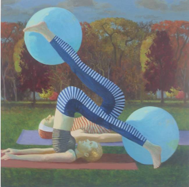
Benjamin Senior, Painting. Pilates in the park becomes a surreal experience.


Benjamin Senior, Painting


Tuesday Nesbitt, Painting


Azusa Murakami, Design Products.


Azusa Murakami, Design Products. A ritualised table for the consumption of fast foods. Utensils include sesame seed picker. The plan includes leaving shoes outside and harvesting fresh herbs from the garden wall, to contribute to slow hamburger consumption.


Kynthia Livaniou, Communication Art & Design (video still). Lovely videos projected on lovely dancers, revideoed, reminiscent of Carlyle Reedy.


Hwang Kim, Design Products. Many people liked work designed to prepare North Koreans for cultural transition to the rest of the world - how to eat pizza, how to do popular music video dances, almost impossible I should think while watched over by portraits of the Dear Leader and the Great Leader, on the wall and on one's lapel.


David Hood, Design Products. Glad to see further development of this walking alternative to the buses - phalanxes of people with square umbrellas and a common destination.


James Harrison, Painting. An assemblage of works on paper.


Kate Groobey, Painting. Thoughts of Bacon and Matisse.


Simon Dara, Communication Art & Design. One of a series of small paintings detailing a private imaginary world.


Heeseon Byun, Painting. She has a lovely way of portraying people in the snowy landscape, which becomes a void emphasising the composition of the figures. This is a small detail.


Laura Bygrave, Painting. Not quite an echo of pop art. I liked it.


Majed Aslam, Painting


Majed Aslam, Painting. An erased photograph. Why didn't I think of that?


All images are installation views and remain copyright the artists.

July 2010

Saturday, 7 March 2009

Simon says: oil paints - everything you wanted to know

'Now,' he said, holding up a five foot long piece of card with three tiny blobs of crimson paint at one end. 'Which of these pigments do you think is going to last the longest?'

This was Simon Pierse, yesterday giving the second of his annual series of demonstrations for painting students at the Aberystwyth University School of Art, a lecture-demonstration on everything you always wanted to know about oil paints (but were afraid to ask). But I'm getting ahead of myself. Why three blobs of apparently identical paint? Were they about to engage in some sort of oil-based race? No, they were three different qualities of oil paints: student (budget) quality, artist's quality, and super quality made from original pigments and not synthetic substitutes. A small tube of each sells at the respective prices of £2-4, £14-18, and around £50. 'So this bit here is about 50p's worth,' quipped Simon. And in turn, using a new brush each time, 'to be fair', he began scrubbing out a long stripe of each colour. No prizes for guessing which one stopped first. Surprisingly, the two more expensive paints lasted nearly twice the distance, but very little difference between them in terms of coverage. The most expensive one (scarlet vermillion) was definitely a slightly different shade of crimson, a little more solid perhaps, but if they weren't right next to each other it would be quite difficult to tell them apart.

For those who would like to know more, what follows (when I get around to typing it in) is a digested version of my notes from the talk. Anything beyond this, you'll have to ask Simon yourself - he is very knowledgeable about historical and contemporary painting techniques.

Topics discussed included: synthetic vs. natural colours, permanence, safety, price, colours you need to get started, application techniques, conservation.

Things to consider with oils: strength, permanence, toxicity, cost.

Toxicity
Oils can be absorbed through the skin. Modern student grade oils will generally present no problem, but be careful especially with old tubes of paint you may inherit.

Watch lead in some paints. It used to be that doctors could tell old artists because they had a white ring around their teeth and gums, characteristic of lead poisoning. Lead colours that used to be available include tins of flake white, naples yellow, creminous white (as used by Lucien Freud). Today I recommend you use titanium white which is a brighter white and doesn't age yellow as flake white does. Lead white is heavy and sticky.

Beware also of the cadmium range of colours as these have a level of toxicity.

Vermillion is mercuric and thus very toxic - but it is difficult to buy now.

Permancence
Most companies have withdrawn the fugitive colours that didn't really last very well. Some to watch that are not permanent include sap green, bright pinks, magenta, and the colours that were new to the Victorains, such as Cotman green, which has turned brown over time.

Prussian blue hue means that the original colour has been matched with modern analine dyes.
Prussian blue genuine means that the colour is made to the old organic or mineral recipe.

Purples tend to be less permanent except for cobalt violet.

Cost
There are three basic grades: student grade, artist oil colours, and the series, for example, Windsor-Newton Series 4 (the most expensive grade). Prices vary tremendously between these grades:

e.g. a small tube of cadmium red:

  • cadmium red hue, student grade, typically £2-4, cheap and good to use for impasto work, if you want to trowel it on
  • cadmium red hue, artist oil colours, £15-16, finely ground, will go further, the kind to use if colour is important
  • cadmium red genuine, Windsor-Newton series 4, £50-60, the real pigment, important for the exact colour, or matching for restoration work

Windsor or spectrum red is cheaper than cadmium as a dye.

It is cheaper to buy from the School of Art shop than from shops in town.

There is also a cost difference among the different colours. Earth colours, such as raw umber and burnt sienna, are cheaper. Cobalt blue and cobalt violets are the most expensive colours. Greens are medium priced. Reds, yellows and purples are more expensive than the greens.

What colours do I need?

When working on a painting you want to keep to a strong, rich palette - avoid blending too many colours in a single painting or it will tend to go muddy. Simon often tries to make a painting using only two colours, although he generally has around 20 in his paintbox.

Some thoughts on good colours to have:

2 reds:
A cadmium red, and a crimson red. Alizarin crimson is the most permanent of the crimson reds. Early pigments for red were organic: berries, bark, bugs. Hence the greenish faces you see in some old paintings, where these pigments have changed over time.

A few yellows (2 to start with):
Yellow ochre, cadmium yellow, cadmium yellow pale, cadmium yellow deep. This last is less useful then cadmium yellow light, but it is long lasting.
Indian yellow - this was originally produced from the urine of cows fed on mango leaves. This is quite a different yellow, quite golden and almost orangey - no point using this one impasto, as it really comes alive thin. You can tell whether it is the organic version, not the synthetic one, because it will come dark and concentrated out of the tube.

Green
Viridian spreads well and is the best all-round green, a bottle green. Windsor green is powerful: lighter, stronger and richer.
He didn't say anything about phthalo green, which I favour. It's quite an electric colour, quite evergreen, and never completely washes out of your brushes.

Blues
Cobalt blue, or French ultramarine is just as fine. The problem with cobalt blue is that it was made from lapis lazuli, a ground up semi-precious stone mined in Afghanistan, and was therefore as expensive a pigment to use as gold (as in, made from gold leaf). In the 19th century there was a competition to find a synthetic (chemical) substitute for lapis, and a Frenchman won, hence the name French ultramarine for the pigment.
Prussian blue is OK too.
Simon likes to use cerulean blue.

Earth colours
Raw umber, burnt umber. Don't use Van Dyke brown (the oil colour pigment, not to be confused with the alternative photographic process), because it isn't permanent.


Transparency
Cobalts, mineral colours and earth colours are opaque.

Thoughts on using your oils
If you need a big quantity of paint it is more economic to buy in tins - however, it will dry in the tine so be sure you are going to use it fast. Oil paint oxidizes to dry - like iron rusting, it changes chemistry, and once it's dry, it's not chemically the same thing as before, so remoistening it won't allow you to manipulate the surface of the painting any more.

Oils dry by getting a skin first, so you can still use the paint underneath.

Palettes
Simon uses an old kitchen top. Bigger is better. You can also use a pane of glass, with a piece of white paper underneath. Tear off paper palette pads are cheap but when you scrape the paints off you can't easily transfer them to the next sheet. This is a problem because when you clean your palette you should first scoop up all the unused paint and sore it at the sides.

Oil paints are at their most stable when squeezed and used directly from the tube, without mixing. But of course the palette is for mixing paint. There is no right or wrong way to do this, but it's easiest to leave the pure colours around the edges of the palette, and then mix them in the middle of the palette.

There are two basic ways of applying paint to the canvas or other surface: fat over thin or alla prima. Fat over thin means that first you sketch in the painting and build up background colours with the paint thinned with turpentine, and later add other layers of paint that are less dilute. Applying paint alla prima basically means that the first layer of paint is the only layer, and you can start working thickly, e.g. with the palette knife, straight away. What you don't wan't to do is put thin over fat, otherwise as the paint dries the colours on top will sink into the under layers, which will suck the oil out of the top layer, leaving a chalky surface.

Oil paint dries the same colour as when it is put on. To test if you've done it right, you can lick your finger and touch the painting when it's dry. If it changes colour, the top layer has sunk - this is not good.

Solvents
Use white spirit to clean up, and turpentine to thin the paint. Turpentine smells of pine resin, which is evident if you leave it out because it goes sticky. Add more turpentine to the bottle as the day goes on. It should be kept in a dark bottle.

You shouldn't use white spirit with oil paints, because it disperses all the oil, and doesn't leave enought to keep the painting lustrous. In your turps or white spirit bottles you'll eventually find a sludge at the bottom that is dry chalky and dull settles and decant with oil suspension (keep using the same turps after draining away the more pure stuff that doesn't settle to the bottom). Use linseed oil to thin the paints - even better, but be sure to use cold pressed (refined?) linseed oil not the stuff for cricket bats (boiled linseed oil), or it will take ages to dry (as I know to my cost!)

Turpentine and white spirit will eventually break down your brushes. Clean your brushes with white spirit and after with soap and water, and they will last longer.

If you have a turpentine allergy, try zestit, which is a thinner made from lemon etc. It is the green option (in the environmental sense), but it is expensive.

As you build up your layers of paint on your surface, gradually add a little linseed oil to your turps. Use a dark bottle to store your linseed oil.

After your painting is finished
Let it dry, especially if you are working with impasto techniques (thick paint, e.g. with the palette knife). This may seem obvious, but it can take up to 6 months to even a year to dry thoroughly (longer if you are Frank Auerbach).

You need to protect the surface of your painting because eventually it will become dirty. You can do this with varnish. Every ten years the varnish can be removed with an old cloth, and the painting then revarnished. Matt varnish is invisible. If the varnish becomes gunky at the bottom of the bottle, the bottle needs heating. Simon uses matt wax picture varnish which is like a turpentine and bees wax paste. Put it on with an old cloth. It is easy to put on too much. Add linseed oil paste to bulk it up.

A final reminder on toxicity:

Artist quality oils (and acrylics) may be toxic. Particularly vermillion, and emerald green. The latter was made traditionally with arsenic, which went black over time, e.g. in the paintings of Monet. Interestingly, Napoleon was poisoned by arsenic in his emerald green wallpaper during his exile on Elba - upon his death, traces of arsenic were found in his hair.

And finally...

Don't be put off by all this information. Play with oils and enjoy. And remember that you can use any paint for your work - tempera, encaustic, or even cheap emulsion (housepaint) from the local DIY shop (that's hardware & housewares stores, for North American readers).

See also: Simon says: how to stretch a canvas

Links:


welcome page ----- Margaret's webpage ----- Facebook ----- Flickr ----- Saatchi Online
Friday, 13 February 2009

Simon says: How to stretch a canvas

Today it is possible to buy cheap and cheerful pre-stretched, pre-primed canvases at any discount stationer's or art supply shop. However, for those wanting to stretch their own, Simon Pierse at the Aberystwyth University School of Art has just given his annual demonstration on how to do so - from scratch. I will be re-presenting his talk here.

Stretching the canvas means putting it onto a wooden frame and fastening it tight like a drum. Pre-prepared canvases you buy in a shop will also be sized (treated to make the surface shrunk and sharp) and primed (painted white, or another colour). Sizing is optional if you work in acrylics, but if you use oils, the paint will seep into the canvas (using more paint, and dulling the colour) and also the painting will eventually disintegrate (probably after you shuffle off your mortal coil, but nonetheless, something to consider if you sell your work professionally).


Things you will need to stretch a canvas:

- canvas or other suitable fabric (more on types of fabric later)

- wooden canvas stretchers

- staple gun or hammer and tacks

- canvas pliers (optional but handy)


If you are sizing the canvas you will need:

- rabbit skin glue (or vegetable-based substitute)

- double boiler or other way to put one container of liquid into a pan of hot water

- kettle to heat the water

- house paint brushes, e.g. 1 or 2 inches wide


If you are priming the canvas you will need:

- gesso (for acrylic)

or

- oil painting primer (alkali based)

- Wooden canvas stretchers


to be continued...


See also, Simon Says: oil paints - everything you always wanted to know